Position
Product Designer
Team Count
3
Platform
App
Filters help users narrow down their search to find the exact types of products they are looking for. Users who engage with Houzz filters are twice as likely to add to cart/make a purchase than users who don’t.
Problem + Research
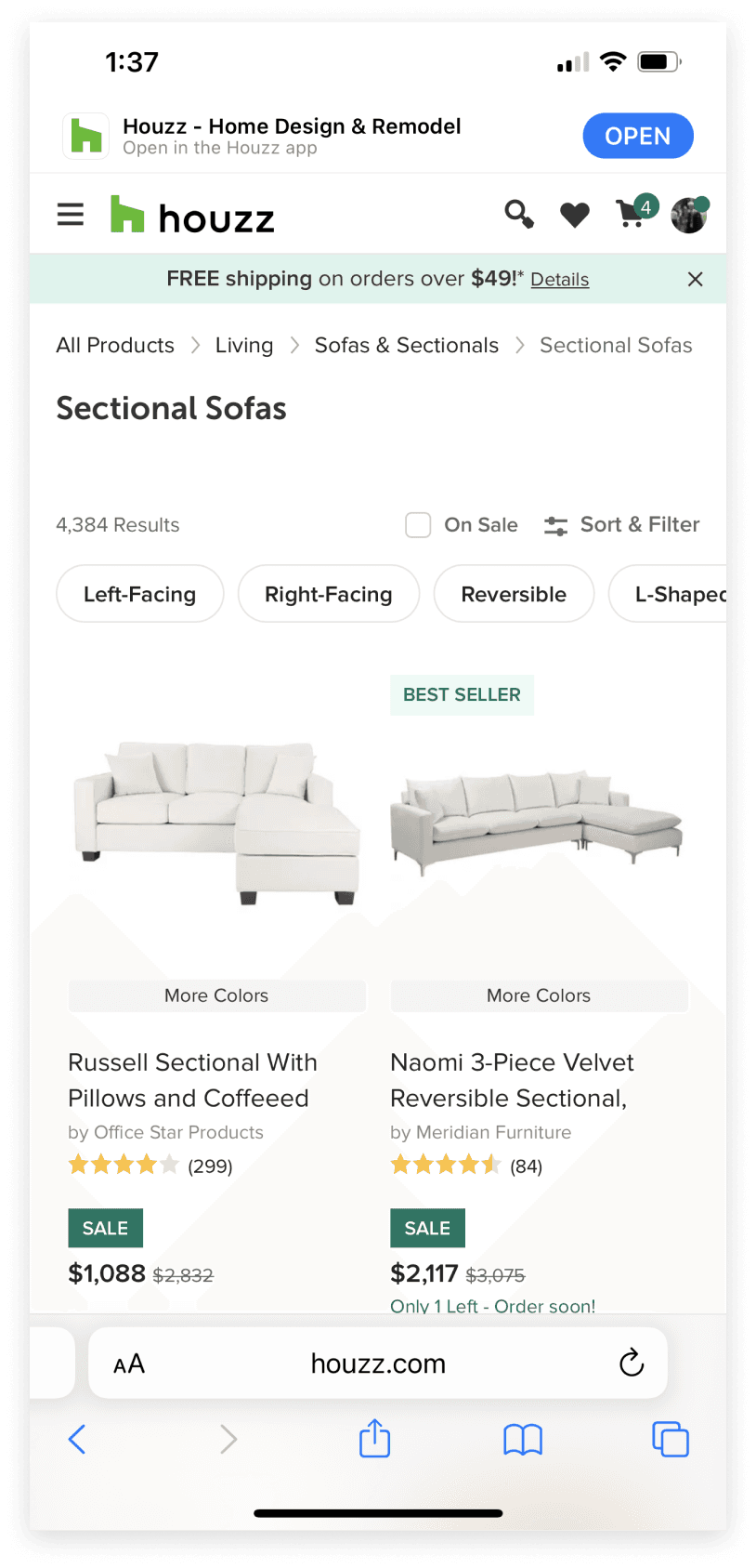
Houzz's existing filtering experience was not optimized and not intuitive. Users looking to filter by very specific parameters were faced with a confusing experience. As well, Houzz was experiencing negative impacts from SEO due to the inaccessibility of filtering.
Painpoints:
1. The drawer closes when users select filters
2. Vertical height is under utilized
3. No clear way to “apply” filters
These pain points were reflected in data that signaled users were frustrated by repeatedly opening the drawer. How can we improve users filtering experience?
Competitive Analysis
Taking a look at competitors and patterns for filtering, it became clear that the best experiences involved very straightforward touch points for browsing, applying, clearing, and engaging with filters. Most filter experiences relied heavily on user input to open and close the filters.


Given the consistency in filter patterns across the industry, as well as Houzz data indicating that users were frustrated with having to repeatedly open the filter to select multiple filters, we hypothesized that if our designs improved the UX of filtering, we would see a meaningful lift in checkout metrics and a decrease in "open" filter drawer clicks.
Design
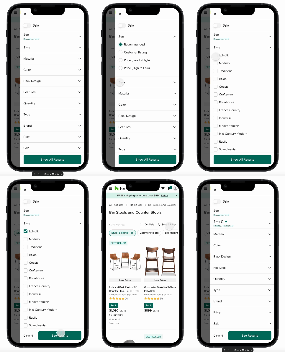
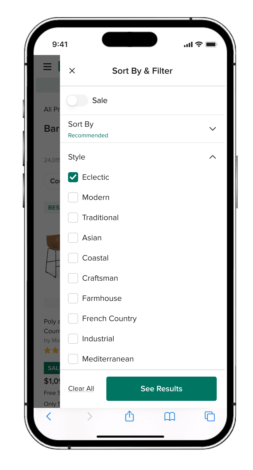
After a few rounds of iteration and design reviews, I narrowed in on our approach. I proposed designs that included: a drawer that only closes after a user taps apply, a larger drawer size, clearer interaction patterns, and improved filter option UI.
Why use a right side drawer for filters? With a drawer we can fully utilize the vertical space to show the long lists of filters we have. The slight gap on the left gives feedback that the results are changing as you select one option. As well, the slight gap allows users to easily tap outside to close the drawer.
We wanted to test all of these assumptions against control to ensure we were designing and building the best experience possible.
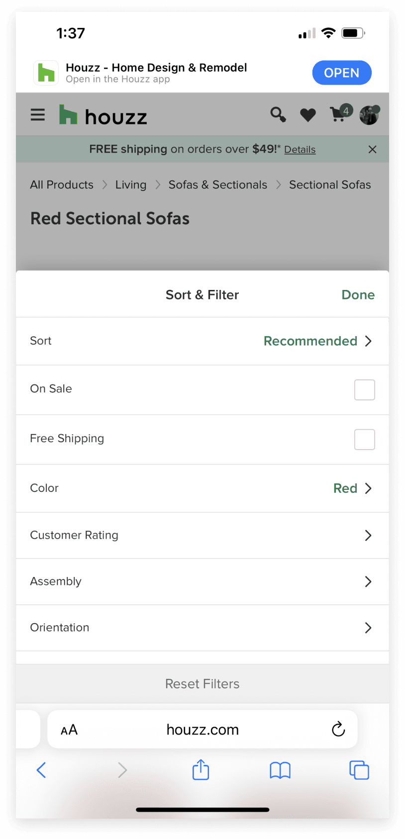
Control
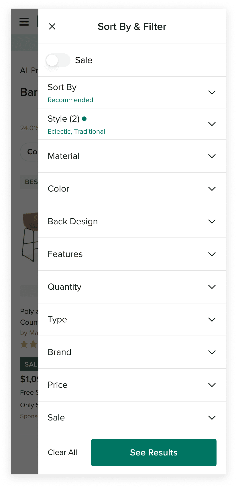
Treatment
Results
From testing we saw a 3% lift in checkouts as well as a drop in filter drawer open clicks, validating our hypothesis. On both app and mWeb, the treatment was ramped to 100%. This is now the default filter experience across all mobile for Houzz users.
© 2024
