Project Brief
Position
Product Designer
Team Count
3
Platform
Web + App
In the e-commerce space, reviews are critically important for users to make informed decisions about what they want to buy. Users often look to reviews to help them decide between one product or another—which makes it crucial for reviews to be easy to read, easy to navigate, and easy to parse through.
Problem + Research
Given Houzz’s prominence in the e-commerce space, we needed to focus energy on making sure the product review section of the product page helped users to get opinions on products they are considering.
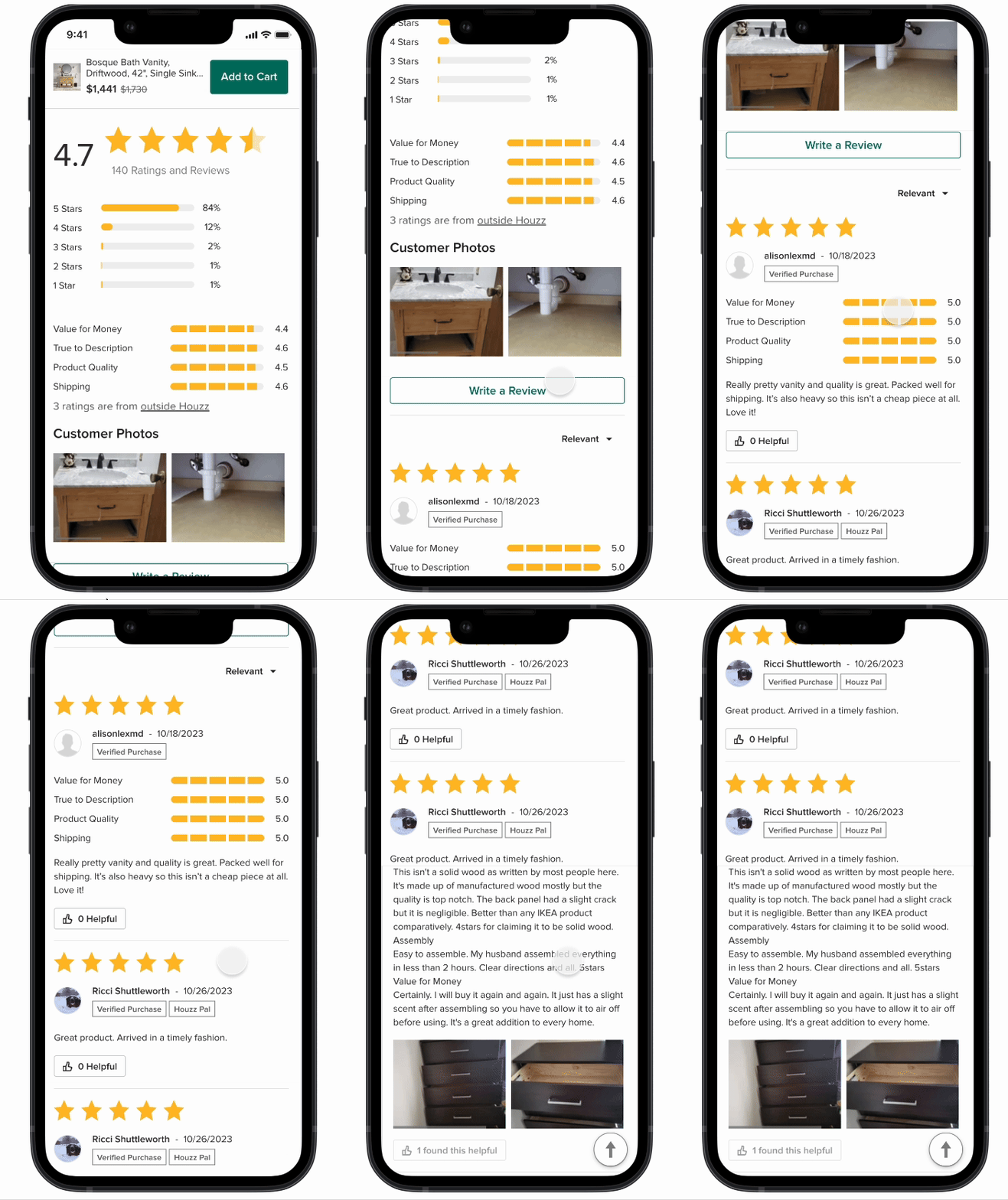
In the control experience, the reviews are convoluted. It’s hard to visualize the ratings and the individual reviews seem confusing.
Pain Points:
1. Individual reviews have rating breakdowns
2. Badging distracts from the reviews
3. Visually and hierarchically cluttered
4. No total review count in individual reviews section
Given the frustrating experience, we wondered how could we improve our reviews experience?
Competitive Analysis
Taking a look at competitors, most emphasize a quick breeze-buy top level view of the reviews with a very visual treatment. The individual reviews are easy to read and include images when present for individual reviews.


Hypothesis
We hypothesized that since control was visually overwhelming and distracts users from specific review content (which ultimately hurts their perception of the product) if we improved the UI of the reviews section through giving prominence to reviews overview, as well as reducing the visual load of each review we would see a meaningful lift in overall marketplace metrics.
Design
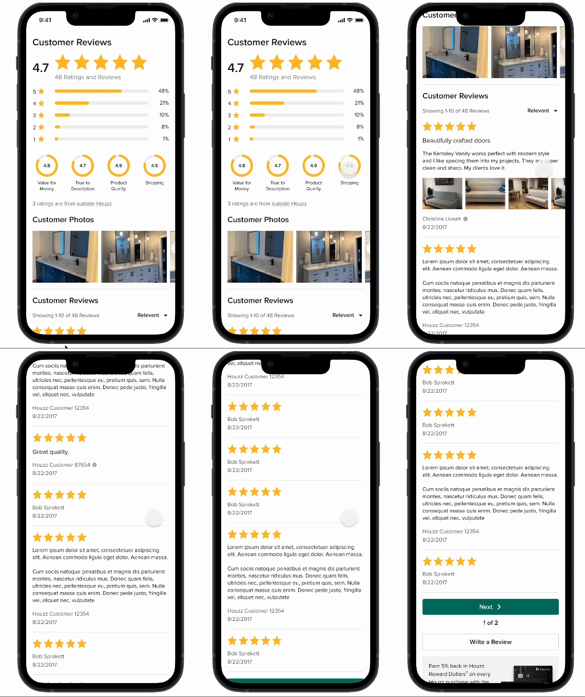
The top section redesign includes a new version of review breakdowns.
There are many potential variations for review content. Some can have a lot of text, some just have ratings. We needed to account for that in the designs. User badging and “helpful” reactions were removed.
Content hierarchy was rearranged to give less prominence to less important information (like reviewer name). Full review count was added to the top of the individual reviews section.
Users can filter by rating by tapping the according rating. Tapping a review photo will open a modal. These interactions do not change from control.
Testing
After extensive QA, the reviews treatment was tested on Houzz.com at 50/50 for 1 months for mobile web users.
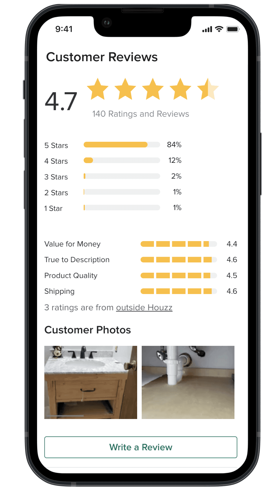
Control
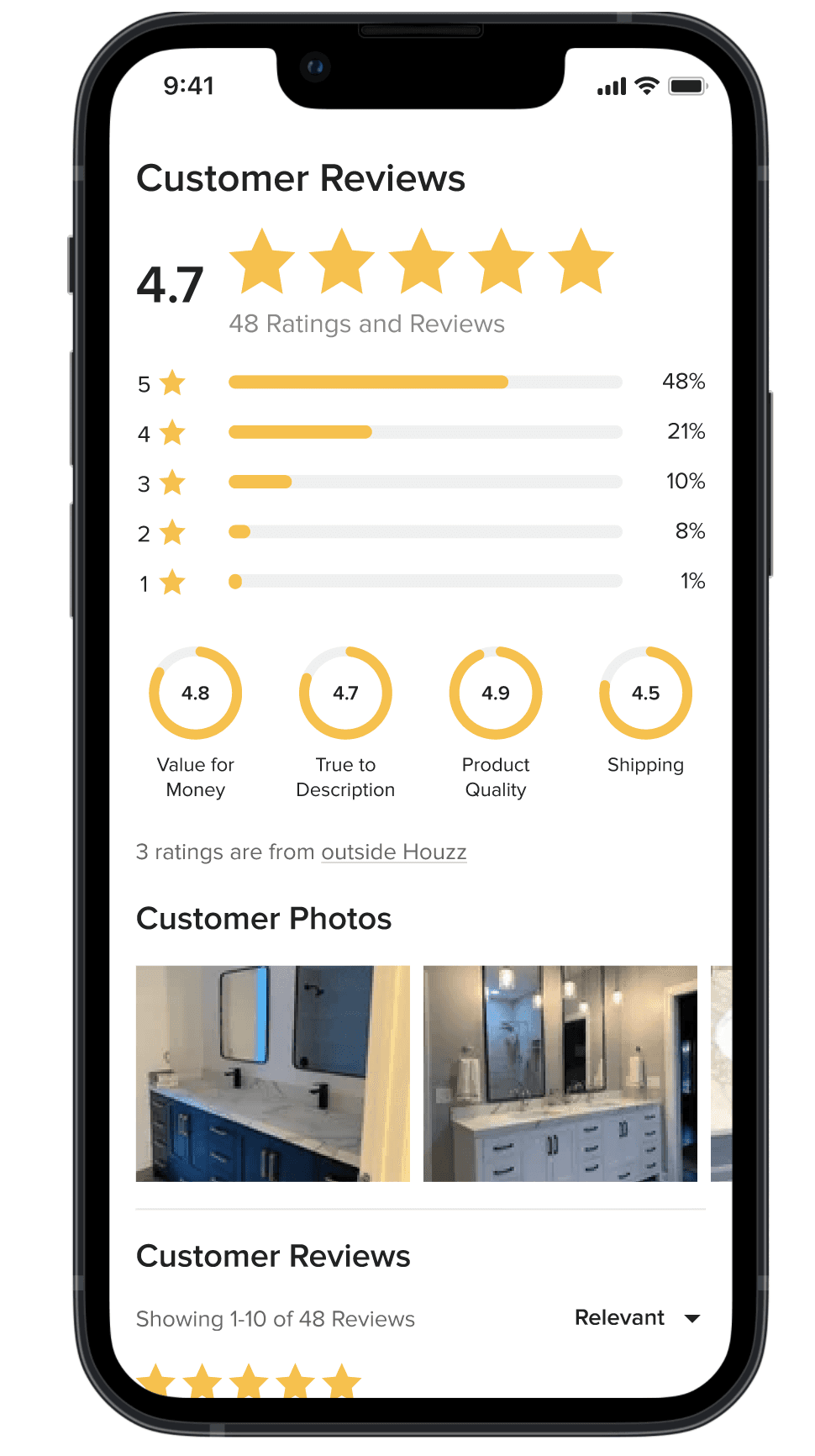
Treatment
Results
From testing we saw a 6.7% lift in GMV as well as a 4.7% lift in order numbers. On mWeb, the treatment was ramped to 100%. This is now the default filter experience across all mobile devices utilizing Houzz.com. This experience was tested and saw similar success on both app and dWeb platforms and have been ramped across the board for all Houzz users.
