Project Brief
Position
Product Designer
Team Count
5
Platform
Web + App
Background
Search is a cornerstone of e-commerce UX design because it empowers users to quickly find what they need in vast product catalogs. A well-designed search experience reduces friction, enhances discoverability, and improves conversion rates by connecting users to relevant results efficiently. Features like autocomplete, filters, and personalized recommendations can further refine the search journey, ensuring it’s intuitive, engaging, and tailored to individual preferences.
Problem + Research
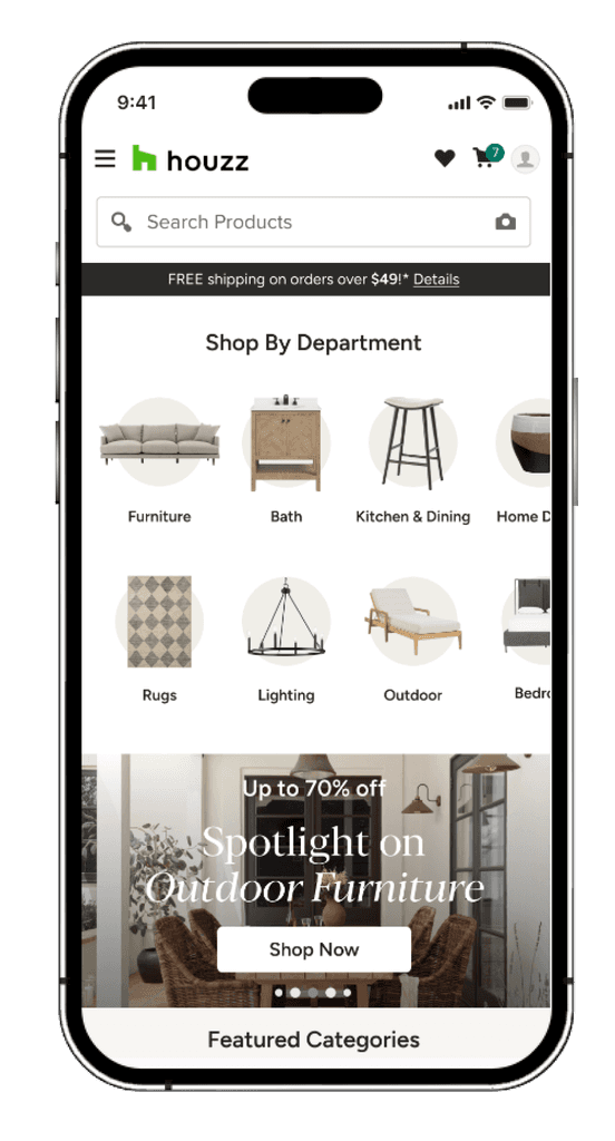
Search is a critical function on Houzz, a three-vertical consumer site, with 40% of app users relying on it to discover products in the marketplace. In it's original state, the search entry point was hard to find, the active search state lacked depth, and the overall experience was neither engaging nor helpful, highlighting the need for significant improvements.
Pain Points with Houzz Search:
1. Search is not visible nor is it intuitive
2. Search UX doesn’t provide users with helpful tools
Hypothesis
If we improved the dated and unhelpful search experience, then we would see increases in engagement, product discovery, and overall marketplace metrics.
The question then became, how can we improve our search experience for marketplace users?
First, we wanted to improve the visibility of the search bar to make it easier for users to engage. Next, we would focus on the user experience after interacting with the search bar, targeting improvements like refining query suggestions for empty searches, optimizing the UI for individual queries, and elevating the active search experience.
Focus 1 — Improve Search Visibility
Incrementally improve the visibility and usability of the search bar to increase engagement.
Test 1 — Exposing Control Search Bar
Understand user palate to see search bar
Control
Only search icon in header
Treatment
Exposed search bar
Results
GMV Lift: +9.4%
Clicks on Search: +68%
Search Completions: +9%
Takeaway
Making the search bar more prominent significantly improved user engagement with search and product discovery.
Test 2 — Updating Search Bar UI
Understand importance of prominence in search bar interaction
Control
Exposed search bar
Treatment
Improved search bar UI
Results
GMV Lift: +7.5%
Search Completions: +5.4%
Takeaway
Enhancing the UI of the search bar further boosted its usability and user engagement.
Recap
These iterative improvements to search visibility demonstrated clear user preference for an accessible and engaging search experience, leading to measurable gains in GMV, search engagement, and product discovery. This gave us the confidence to proceed with more testing across different search states.
Focus 2 — Improve Search UX
Improve usability across various search states to enhance user engagement and drive key marketplace metrics.
Test 1 — Adding Image Thumbnails to Query Suggestions
Enhance visual vocabulary and usability of query suggestions across all search states.
Control
No images
Treatment
Image thumbnails
Results
Cart Adds: +1.3%
Checkouts: ~+3% for users in the test bucket
Positive conversion rates for users in the test bucket
Takeaway
Visual cues like thumbnails helped users better understand query suggestions, improving engagement and driving conversions.
Test 2 — Improving Usability of Empty Search
Give "Trending Searches" more interactive UI
Control
Empty Search
Treatment
Trending Searches with pill UI
Results
CTR: +7.5%
Positive downstream metrics across engagement and product discovery.
Takeaway
While trending searches represent ~2% of search traffic, this improvement had a meaningful impact on GMV due to increased engagement with this feature.
Test 3 — Faceted Queries in Active Search
Help users refine results while typing their queries
Control
Basic query UX
Treatment
Added dynamic facets for individual queries
Results
Clicks: +2.07%
Browse Products Page Views: +2.68%
Takeaway
Facets improved search precision, guiding users closer to their desired results and increasing interaction with product pages.
Test 4 — Sticky Search Bar vs. Sticky Filters on Browse
Understand how users navigate to products
Control
No persistent navigation
Treatment A
Sticky Search Bar
Treatment B
Sticky Filter Bar
Results
Search Clicks: +6%
Positive downstream metrics across engagement and product discovery for sticky search
Takeaway
Users favored search as their primary navigation tool, with the sticky search bar driving increased interaction and better results. Users on Houzz prefer to search to discovery products rather than filter.
Test 5 — "Pick Up Where You Left Off"
Understand Discover playability for seeing prior intent modules in search
Control
No prior intent content
Treatment
Prior intent page within search
Results
Poor engagement leads to decreased downstream metrics
Takeaway
Trying to reduce impact on the vertical height of search was not worth the trade off of for a more complex UX in search.
Summary of Testing Impact
Across Focus 1 (Search Visibility Testing) and Focus 2 (Search Usability Testing), the enhancements delivered significant improvements to the user experience by making search more accessible, intuitive, and effective.
Key Impacts on User Experience:
Improved Search Visibility
Streamlined Search Interactions
Enhanced Usability Across Search States
Overall User Experience Gains:
The iterative improvements made search more prominent, visually engaging, and efficient, allowing users to navigate vast product catalogs with ease. These changes led to tangible increases in engagement, product discovery, and conversion rates, ultimately enhancing user satisfaction and driving marketplace success.
These tests have demonstrated that adding visual features in search enhances interaction, paving the way for future testing. The testing surrounding prior intent, while not successful, opened the door to further testing how we can add product recommendations and deeper personalization to further optimize the search experience.


